Encyclopaedia of Typefaces
Two thousand typefaces, fully mapped
Description
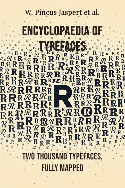
There is a particular kind of book that never announces itself as important. It sits on a shelf near the drawing board, thick and unglamorous, and it gets pulled down not to be read but to be checked against. The Encyclopaedia of Typefaces, first assembled by W. Pincus Jaspert and his collaborators in the mid-twentieth century, is exactly that kind of book. Its ambition is stated plainly on the cover and nowhere else: gather the typefaces, show each one, name each one, and put them in an order anyone can follow. Around two thousand faces, laid out so a working designer can find the right one before the coffee goes cold.
The trick is that a book like this is easy to underestimate and hard to make. Showing one typeface is trivial. Showing two thousand — each with its Roman, Lineale and Script forms, upper and lower case, and the numerals that so many specimen books quietly skip — is a feat of organisation before it is anything else. The Encyclopaedia keeps arriving in new editions, most recently a fifth, with material aimed at graphic artists, desktop publishers and website designers who were not even imaginable when the first pages were set. The tools changed underneath it. The job it does did not.
What makes it worth pausing over is not any single face inside it. It is what the whole thing quietly became. A book meant to help you choose ended up helping the trade agree on what there was to choose from — and on what to call it. That is a larger power than a specimen book usually admits to holding.
The question we’re asking : how does a plain inventory of two thousand typefaces end up shaping the way an entire craft sees itself?What we’ll see : the making of the catalogue, the discipline behind its layout, the language it hands its readers, and what happens when a reference quietly becomes the definition.
Table of contents
01Chapter 1 — A catalogue that outlived its own century
The Encyclopaedia of Typefaces belongs to a lineage of specimen books that stretches back to the foundries themselves. For centuries, anyone who cast metal type printed sheets showing what their faces looked like — the specimen sheet was both advertisement and instruction manual. What Jaspert and his co-authors, Berry and Johnson, did was different in scale. Instead of one foundry showing its own wares, they set out to gather the faces of many, across countries and decades, into a single alphabetised reference that treated the whole field as one library rather than a scatter of competing catalogues.
The choice to alphabetise by the name of the face is more consequential than it sounds. It means the book is organised the way a user thinks — I have heard of this face, where is it — rather than the way the industry produced it, foundry by foundry, era by era. That decision quietly turns a collection of commercial products into something closer to a dictionary. You look a face up. You find it. You compare it, on the same page or the next, with its neighbours.

02Chapter 2 — How you fit two thousand faces on a page
The invisible achievement of the Encyclopaedia is the layout. Setting one typeface as a specimen is a design problem with an obvious solution. Setting two thousand, so that each is legible, comparable, and findable, while the pages still feel like a coherent book rather than a phone directory, is a problem with no obvious solution at all. The answer the book settles on is consistency: every face gets shown on the same terms, so that the differences between faces — and not the differences in how they were photographed or sized — are what the eye picks up.
Each entry carries the Roman, the Lineale and the Script variants where they exist, in upper and lower case, with the numerals. Roman here means the upright, serifed letterforms that most text is set in; Lineale is the trade's word for the sans-serif faces, the ones without the small terminal strokes; Script covers the faces that imitate handwriting. Showing them side by side under one name lets a reader see a family as a family, rather than as three unrelated products that happen to share a label.
03Chapter 3 — The vocabulary that came with the book
A reference this large cannot just show; it has to sort, and to sort you need words. The Encyclopaedia comes with a glossary of technical terms and guidance on classification, and this apparatus is not a footnote to the specimens — it is half of what makes them usable. Two faces that look alike need to be described in a shared language before anyone can say precisely how they differ, and that language is not something a designer is born knowing.
The classification advice matters most because typefaces resist tidy filing. The old British system the trade grew up with — Roman, Lineale, Script, and the categories around them — is one attempt at order; the later Vox classification, which many designers absorbed almost without noticing, is another. The Encyclopaedia does not pretend the question is settled. It gives the reader enough of the scheme to place a face in a rough family, which is usually all a working designer needs: not a perfect taxonomy, but a shelf to reach toward.
04Chapter 4 — When the reference becomes the record
Step back from the individual pages and a larger effect comes into view. A book that sets out only to list what exists ends up, by the sheer fact of listing, deciding what counts as existing. If a face is in the Encyclopaedia, it is part of the shared inventory the trade reasons about. If it is not, it lives at the edge of the map, harder to name and harder to ask for. The catalogue that meant to be neutral becomes, without ever claiming to, a kind of census.
This is the quiet power of reference books in general, and the Encyclopaedia is an unusually clean example of it. The order it chose — alphabetical, by face, with a fixed set of variants — became the order many designers carry in their heads. The categories it borrowed and clarified became the categories they argued in. A specimen book is supposed to reflect the field. Over enough editions, the field starts to reflect the specimen book, because that is where everyone looks first.
05Conclusion
Pull the book down again and it is still, on its face, exactly what it says: around two thousand typefaces, alphabetised, each shown in its Roman, Lineale and Script forms, in both cases and with the numerals, plus a glossary and some advice on how to sort them. Nothing about that description sounds like an act of authority. It sounds like a well-kept drawer. And yet the fifth edition, updated for graphic artists, desktop publishers and website designers who work in tools the first compilers never saw, keeps doing the thing that made it matter — giving a scattered craft one place to look and one language to look with.
Related books