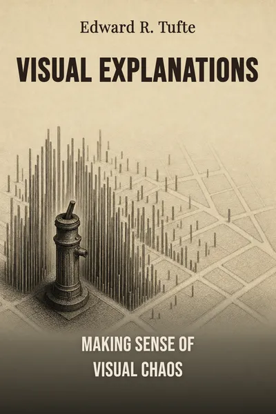
Visual Explanations
Making sense of visual chaos
Description
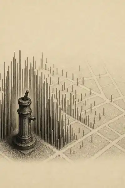
In 1854, a London physician named John Snow was trying to work out why people in Soho were dying of cholera. The prevailing theory blamed bad air. Snow suspected the water. So he did something that looks obvious now and was radical then: he drew a map of the neighborhood and marked, with a small bar for each death, exactly where the victims had lived. The bars piled up, thick and unmistakable, around a single public water pump on Broad Street. He had the handle removed. The deaths, already falling, kept falling. A map had made an argument that words alone had failed to settle for years.
That map sits near the center of Visual Explanations, the 1997 book by Edward Tufte — the statistician and Yale professor who spent his career studying how images can clarify or corrupt our thinking about evidence. His subject is not decoration. It is reasoning: how a chart, a diagram, a map, or a data table can help us see a cause, a comparison, a change over time. And, just as often, how the same tools get used to hide exactly what we most need to see.
We live surrounded by these things — dashboards, infographics, weather maps, slides that flash by in meetings we half-remember. Most of them are treated as visual garnish, something to make the real content look finished. Tufte's wager is the opposite. When an image is doing its job, it is not illustrating the thinking. It is the thinking. And when it fails, people can die of it.
The question we’re asking : When does a picture actually help us reason about evidence — and when is it quietly doing the opposite?What we’ll see : How the same graphic tools that cracked a cholera epidemic can also bury a warning nobody manages to read in time.
Table of contents
01Chapter 1 — A pump handle and a dead map
Snow's cholera map is Tufte's opening case because it does everything a good visual explanation should. It answers a specific question — where are the deaths clustered? — by putting cause and effect into the same frame, so the eye can do the comparing. The pump and the deaths share one piece of paper, and the pattern jumps out without anyone having to be told what to conclude. The map does not decorate an argument that already exists elsewhere. It is where the argument happens.
But Tufte is careful not to turn Snow into a hero of pure vision. The map alone did not prove the case, and Tufte pushes back on the tidy legend that removing the pump handle stopped the epidemic. The outbreak was already declining by the time the handle came off. What Snow actually did was harder and slower: he checked the exceptions. A workhouse near the pump had few deaths — it had its own well. A brewery had none — the workers drank beer. Deaths far from Broad Street turned out to be people who had traveled to drink that particular water because they liked its taste.

02Chapter 2 — How to lie with a chartjunk
If Snow shows what a graphic can do, Tufte's counter-example is the one that haunts the book: the space shuttle Challenger, which broke apart in January 1986, seventy-three seconds after launch, killing all seven aboard. The cause was known in advance. The rubber O-rings sealing the joints of the solid rocket boosters stiffened in cold weather and could fail. The night before the launch, engineers at the contractor Morton Thiokol argued to delay because the forecast was freezing. They had the data. They lost the argument.
Tufte's claim is that they lost partly because of how they showed it. The engineers assembled charts, but the charts scattered the crucial relationship — temperature versus O-ring damage — across many pages and cluttered them with rocket drawings and irrelevant detail. Nowhere did a single clear graphic place the launch-day temperature next to the damage record from previous flights. The one comparison that mattered was never put in one frame where a decision-maker could see it. The evidence existed; the explanation did not.
03Chapter 3 — The smallest effective difference
Having shown the stakes, Tufte turns to method — and his method is stubbornly minimalist. His governing principle is what he calls the smallest effective difference: make every visual distinction as subtle as it can be while still doing its work. If a thin gray line separates two regions clearly, you do not need a thick black one. If a light tint marks a category, you do not need a saturated block of color. Every mark on the page competes for attention, so each one should have to justify itself.
The reasoning behind this is not aesthetic fussiness; it is about capacity. A reader has limited attention, and a graphic spends it. Loud borders, heavy grids, redundant labels, and gratuitous color all consume attention that should go to the data itself. Tufte's ideal is a page where the information is dense but never crowded, where the eye can move between comparisons without being shouted at. He admires old scientific diagrams, railway timetables, dance notation, magician's instructions — anything that packs many precise distinctions into a small, calm space.
04Chapter 4 — Design as an argument about evidence
Step back from the individual cases and a single conviction runs through the whole book: a visual explanation is not the wrapping around a piece of reasoning. It is the reasoning, made visible. This is why Tufte refuses to treat graphic design as a matter of taste. When Snow's map places pump and deaths in one frame, it is not styling an argument that lives somewhere else — the argument only becomes checkable because of how the marks are arranged. And when the Challenger charts split temperature from damage across many cluttered pages, the failure is not cosmetic. It is a failure to think clearly in public, at the exact moment thinking clearly mattered most.
That fuses two things we usually keep apart. We tend to imagine that first you have the evidence and the logic, and then, separately, you dress it up for presentation. Tufte's cases collapse that sequence. The quality of the display and the quality of the inference turn out to be the same variable. A graphic that hides its comparisons is not badly decorated; it is badly argued. One that survives a skeptic's questions is not attractive; it is honest.
05Conclusion
John Snow's map still works today, more than a century and a half after he drew it, because it does the one thing Tufte keeps returning to: it lets us see a comparison and check it against the cases that might break it. The Challenger scatterplot he redrew works for the same reason and stings for the opposite one — the pattern was always there in the numbers, waiting for someone to put it in a single frame where a decision could be made from it. Between those two images sits the whole distance between a graphic that reasons and a graphic that merely appears.
Related books