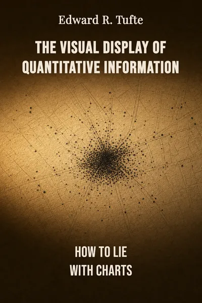
The Visual Display of Quantitative Information
How to lie with charts
Description
In the autumn of 1854, a physician named John Snow drew dots on a map of London's Soho district. Each dot marked a death from cholera. As the dots accumulated, they clustered — thickly, unmistakably — around a single water pump on Broad Street. Snow had the pump handle removed. The outbreak, already fading, was checked. That map did something no table of numbers could have done: it made a cause visible. Edward Tufte opens his 1983 book on data graphics by returning to that map, because it is one of the rare drawings in history where the picture carried the whole argument, and the argument turned out to be right.
Tufte, a political scientist and statistician who taught at Princeton and later Yale, self-published "The Visual Display of Quantitative Information" after publishers balked at the printing costs he insisted on. He wanted the graphics reproduced beautifully because the book is, at bottom, about beauty in service of truth. It became a quiet landmark — the book people in statistics, journalism, and design keep on the shelf and keep opening. Across 250 illustrations, it lays out how a chart can show data with clarity and precision, and how, just as easily, a chart can mislead.
That second possibility is the one that unsettles. A sentence that lies can be argued with; a graph that lies slips past our defenses, because we tend to trust the eye more than the paragraph. Tufte's project is to arm that eye — to make us readers of graphics rather than passive receivers of them, and to hold designers to a standard they rarely meet.
The question we’re asking : When does a chart clarify the numbers, and when does it quietly distort them?What we’ll see : How graphics can carry an argument, how they deceive, and what separates an honest picture from a decorated one.
Table of contents
01Chapter 1 — The chart that stopped an epidemic
Snow's cholera map is Tufte's favorite kind of graphic because it does the maximum with the minimum. It is not decorated. It does not flatter the reader. It simply places every death in the place it happened, and lets the spatial pattern speak. The clustering around the Broad Street pump was not an interpretation laid over the data — it was the data, arranged so the reader could see the thing Snow suspected. Good statistical graphics, in this reading, are instruments of reasoning about quantitative information, not illustrations decorating a conclusion already reached elsewhere.
Tufte pairs Snow with an even older master, the Scottish engineer William Playfair, who around the 1780s and 1790s more or less invented the line graph, the bar chart, and the pie chart as we know them. Playfair grasped that a trend over time — a nation's imports and exports, a century of wheat prices against wages — becomes legible as a shape when you plot it, and stays invisible as long as it sits in a column of figures. The second edition of Tufte's book reproduces Playfair's engravings in color for the first time, and the point of the care is not nostalgia. It is that these two-hundred-year-old drawings still outperform much of what appears in newspapers and annual reports today.

02Chapter 2 — The lie factor
The counterpart to the honest map is the deceptive graphic, and Tufte treats deception not as an accident but as something with identifiable sources. His sharpest tool is a simple ratio he calls the lie factor: the size of the effect shown in the graphic divided by the size of the effect actually present in the data. When a drawing exaggerates a change by drawing it three times larger than the numbers warrant, the lie factor is three. An honest graphic sits at one. The whole point is that this is measurable — deception in charts is not a matter of taste but of arithmetic you can check.
The classic offender is the object scaled in two dimensions to represent a change in one. A newspaper wants to show that fuel-economy standards rose by roughly half, so it draws a small car and a large car — but makes the large car both taller and wider, so its area balloons far more than the underlying figure. The eye reads the area, not the length, and comes away believing in a change several times bigger than the real one. Tufte documents cases where the lie factor ran past fourteen. Nobody typed a false number; the distortion lives entirely in the drawing.
03Chapter 3 — Ink that does no work
If deception is the loud failure, clutter is the quiet one, and Tufte's most quoted idea addresses it directly: the data-ink ratio. Every graphic is made of ink. Some of that ink represents data — the position of a point, the height of a bar, the slope of a line. The rest is everything else: the heavy grid, the drop shadows, the decorative borders, the cross-hatched fills, the little clip-art figures marching across the background. Tufte's guideline is to maximize the share of ink devoted to data and, within reason, to erase the rest. A large part of good design, he argues, is the disciplined subtraction of what does no work.
He coins a word for the worst of the surplus: chartjunk. The moiré patterns that vibrate when you stare at them, the ornamental grids darker than the data they frame, the gratuitous three-dimensional effects that turn a simple comparison into a wobbling sculpture — all of it competes with the numbers for the reader's attention and usually wins. The scandal is that this decoration is often added precisely because the underlying data is thin. A single figure gets dressed up in a whole wardrobe of graphical costume to disguise how little it says. Strip the costume away and you often find there was no reason to draw a chart at all.
04Chapter 4 — The friend who reads the graph
Step back from the individual charts and the deeper claim comes into view: we grant graphics an authority we rarely grant sentences. A paragraph that overstates its case invites us to push back — we read prose as argument, made by someone with a point of view. A chart arrives looking like a fact, as if the numbers had drawn themselves. That is exactly why the lie factor and the data-ink ratio matter beyond the drafting table. Tufte is describing a form of rhetoric that works below the level of conscious reading, and asking us to become conscious of it.
This reframes what graphical integrity actually is. It is not a matter of taste, and it is not decoration you add or subtract to suit a house style. It is closer to honesty in testimony. When a designer inflates an area, shifts a baseline, or buries a real relationship under chartjunk, the offense is not aesthetic clumsiness — it is a small breach of trust with everyone who will glance at the thing and believe it. Tufte's principles are usually filed under design, but they read more like an ethics of showing: the picture must not claim more than the numbers allow.
05Conclusion
Return to Broad Street. Snow's dots worked because the drawing added nothing the numbers did not contain and hid nothing they did. The pump was where the deaths clustered, and the map let anyone see it. That is the whole book in one image: a graphic as an instrument for thinking about evidence, built to be trusted because it earned the trust. Everything Tufte catalogs afterward — the lie factor, the data-ink ratio, chartjunk, small multiples — is machinery for telling the drawings that keep faith with their numbers from the drawings that don't.
Related books