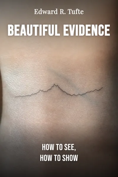
Beautiful Evidence
How to see, how to show
Description
Edward Tufte was born in 1942 in Kansas City, and by the time he'd become a professor of statistics, graphic design, and political economy at Yale, he had a habit that most academics don't: he self-published his own books, oversized, thick-papered, obsessive about ink and margins. The New York Times once called him "the Leonardo da Vinci of data." In 2006 he released the fourth of these volumes, Beautiful Evidence, and the title carried a small provocation. Evidence, we tend to think, is a dry thing — spreadsheets, tables, the raw stuff you argue from. Tufte wanted us to see it as something that could be beautiful, and more than that, something whose beauty was inseparable from its truth.
The book opens on an idea that sounds more like an artist's manifesto than a statistician's: science and art have in common an intense kind of seeing, the wide-eyed observing that generates visual information in the first place. A physician reading a scan, a naturalist sketching a bird, an engineer studying a bridge — they all start by looking hard. The question Tufte spends three hundred pages on is what happens next: how the private act of seeing becomes the public act of showing, how a mind that has understood something turns that understanding into marks on a page that another mind can follow.
That passage — from seeing to showing, from data to explanation — is where most of the world's charts, slides and diagrams quietly fail. They confuse, they flatter, sometimes they deceive. Tufte's wager is that the failures aren't random, and neither are the successes. There are principles, and they can be named, taught, and used from both sides of the transaction.
The question we’re asking : How does the private act of seeing become a public display another person can trust?What we’ll see : A statistician's case that showing evidence well is a craft with rules, a vocabulary, and a shared ethics.
Table of contents
01Chapter 1 — Seeing that becomes showing
Tufte builds the book around a single hinge: the move from observing to displaying. A researcher squints at the world and notices a pattern; then comes the harder work of making that pattern visible to someone who wasn't there. The two acts feel continuous but they aren't. Seeing is generous — the eye takes in far more than it can hold. Showing is a act of ruthless editing, deciding what survives onto the page and what gets left in the dark. Most bad graphics, in his telling, come from people who never quite made that decision on purpose.
His first principles are almost embarrassingly plain. Show comparisons, because reasoning is comparative. Show causality where you can, because that's what viewers really want to know. Show more than one variable at a time, because the world has more than one. Integrate words, numbers and images rather than segregating them into separate zones with legends we have to hunt through. And — the one that reads like an ethics clause — document your sources and your methods, so a skeptical reader can retrace your steps.

02Chapter 2 — The tools of trust
If a display is a claim, then the reader is entitled to interrogate it. This is where Beautiful Evidence turns its gaze around and speaks to the consumer of graphics rather than the producer. Tufte's guiding question becomes almost forensic: on what grounds should we believe what this chart is telling us? He wants to hand ordinary viewers the analytical tools that let them assess credibility instead of simply trusting the ink.
One test he returns to is whether the display invites comparison or forecloses it. A number floating alone means little; a number set beside its neighbors, its past, its alternatives, can be judged. Honest evidence tends to expose itself to comparison rather than hiding from it. Another test is measurement: is there a scale, a unit, a baseline? A chart that shows change but hides where zero sits is not neutral, it is steering. Tufte reads these choices the way a lawyer reads a contract — the fine print is where the intent lives.
03Chapter 3 — Sparklines and the rest of the vocabulary
A book about showing wouldn't be complete without new ways to show, and Tufte doesn't just critique — he invents. The most enduring of his proposals is the sparkline: a tiny, word-sized graphic that lives inside a sentence or a table cell, with no axes, no labels, just the shape of a trend. A stock price, a heart rhythm, a season of rainfall, compressed to something you can read at the resolution of text. The idea was that data-graphics needn't be framed, isolated events on their own pages. They could become part of the flow of prose, as ordinary as a comma.
The sparkline captured something Tufte cared about across the whole book: data density, the amount of information delivered per square inch, treated not as clutter but as generosity. A single well-made display can hold what would take pages of prose to say, and the eye is fast enough to take it in. He points repeatedly to great historical examples that pack enormous quantity into small space — railway timetables, weather maps, the annotated scientific illustrations of earlier centuries — and asks why modern presentation had grown so thin by comparison.
04Chapter 4 — When the presentation lies to us
Beautiful Evidence has a sharp, almost angry stretch aimed at how evidence gets corrupted, and its most famous target is the software slide deck. Tufte had already published a small broadside against PowerPoint, and here he folds it into the larger argument. His charge isn't that slides are ugly. It is that the format itself thins the reasoning: the bullet list fragments arguments into disconnected phrases, the low data density starves the viewer, the linear sequence hides the relationships between things, and the sales-pitch rhythm rewards assertion over evidence.
His case study cut close to the bone. In the 2003 loss of the space shuttle Columbia, engineers assessing the damage from a piece of foam strike had buried the crucial uncertainty inside a nested hierarchy of slide bullets, where the most alarming numbers sat at the bottom in the smallest type. Tufte argued that the format had helped obscure a life-and-death signal. The medium wasn't neutral. It had shaped, and degraded, the thinking that passed through it.
05Conclusion
The last stretch of the book steps off the page entirely. After chapters spent on paper and pixels — what Tufte calls flatland — he moves into three-space and time, the real world of objects you can walk around and moments that unfold. He looks at sculpture, at scientific instruments, at the way we reason about things that have depth and duration rather than living as marks on a flat surface. The two-dimensional display, it turns out, was always a translation of something richer, and the translation is where both the art and the danger lie.
Related books