
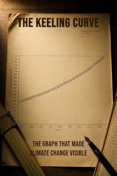
The Keeling Curve
The graph that made climate change visible
Description
In March 1958, a young geochemist named Charles David Keeling installed a gas analyzer at the Mauna Loa Observatory in Hawaii, more than three thousand metres above the Pacific. The site had been chosen for its remoteness far from cities and forests, swept by trade winds that mixed the atmosphere thoroughly. Keeling wanted a place where the air would tell the truth about the planet rather than about the nearest highway. He started taking continuous measurements of carbon dioxide, and he intended to keep doing it for as long as anyone would let him. He could not have known that the data series he was beginning would become the most consequential graph of the twentieth century.
Before Keeling, the question of whether atmospheric CO2 was rising was not really a question scientists could answer. Earlier measurements had been scattered, contaminated by local pollution, and inconsistent in method. The prevailing assumption was that the oceans absorbed whatever carbon humans emitted, and that the atmosphere stayed stable. Keeling's contribution was less a theory than an instrument and a discipline — an analyzer accurate enough to detect changes of one part per million, and the patience to keep it calibrated through funding cuts and equipment failures.
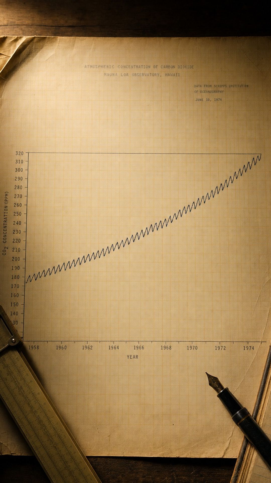
The graph that emerged is now known simply as the Keeling Curve. It rises. It oscillates with the seasons. It does not bend toward stability. Decade by decade, the line climbs steeper. Looking at it does not require any climate theory. The data alone says something is changing in the composition of the atmosphere we breathe, and the rate of change is accelerating rather than slowing.
The question we're asking: how did one researcher's stubborn record-keeping settle a debate, and what did the curve reveal that nobody expected?
What we'll see: the man, the mountain, the saw-tooth, and what the line looks like seventy years on.
Table of contents
01A man with an instrument
Charles Keeling earned his PhD in chemistry at Northwestern in 1954, and his first postdoctoral work was at Caltech under Harrison Brown, a geochemist interested in the carbonate chemistry of natural waters. Keeling had built a manometer of unusual precision as part of his thesis work, and he started using it to measure CO2 in the air. He drove around California taking samples in flasks, from rooftops and from forests on the Pacific coast. He noticed something nobody had documented before: the readings were remarkably consistent across very different locations, around 310 parts per million, suggesting atmospheric CO2 was well-mixed at a global level.
This consistency mattered. If CO2 concentrations varied wildly from place to place, no single station could speak for the planet. If the gas mixed thoroughly, a careful station could. Keeling came to the attention of Roger Revelle at the Scripps Institution of Oceanography, who had co-authored a 1957 paper warning that humans were running a one-time geophysical experiment by burning fossil fuels. Revelle hired Keeling to set up continuous monitoring as part of the International Geophysical Year of 1957-1958, the same effort that produced the first satellite launches.
02Reading the saw-tooth
The seasonal oscillation turns out to be the breathing of the northern hemisphere's forests. From spring through summer, plants in the temperate and boreal forests of North America, Europe and Asia photosynthesize intensively, pulling CO2 out of the air. From autumn through winter, photosynthesis slows while decomposition releases CO2 from leaf litter and soils. Because most of the planet's land mass and most of its forests sit in the northern hemisphere, the global atmospheric signal follows the northern seasons. The curve drops about six parts per million from May to October each year, then climbs back.
The saw-tooth also gave Keeling a way to validate his instrument. If a station was working correctly, it should show this seasonal pattern. Stations that did not were probably picking up local contamination. The internal consistency made the curve harder to dismiss as an artifact, and easier to defend during the funding fights that periodically threatened the program. By the late 1960s, with a decade of data, the underlying upward trend was no longer arguable. The atmosphere in 1968 contained measurably more CO2 than the atmosphere in 1958.
03The debate the data ended
Through the 1960s and 1970s, the rising line was increasingly hard to ignore in scientific circles, but it took longer to enter public conversation. The 1979 Charney Report, commissioned by the United States National Academy of Sciences and led by meteorologist Jule Charney, took the Keeling data as its starting point and concluded that doubling atmospheric CO2 would warm the planet by somewhere between 1.5 and 4.5 degrees Celsius. That range has held up remarkably well across forty-five years of subsequent research. Keeling's data was the input. Charney's analysis was the projection.
In 1988, NASA scientist James Hansen testified before the United States Senate during a heatwave summer and argued that the warming predicted from rising CO2 was already detectable in the temperature record. The hearing made the front page of the New York Times. The Intergovernmental Panel on Climate Change was formed the same year. The Keeling Curve, by then thirty years old, had become the visual shorthand for the entire discussion. Whatever one thought about projections, the line itself was data.
04What the line shows now
Looking at the Keeling Curve in 2026 is a different experience from looking at it in 1990. The annual saw-tooth still rises through each winter and falls through each summer, but the underlying trend has steepened. In the 1960s, atmospheric CO2 was rising at less than one part per million per year. In the 2020s, the rate is closer to 2.4 parts per million per year, and individual years now occasionally exceed three. The acceleration tracks global emissions, which despite repeated commitments to reduce have continued growing, with brief dips during the 2008 financial crisis and the 2020 pandemic followed by quick rebounds.
What the curve does not show is worth being precise about. It measures concentration, not emissions. It measures CO2, not other greenhouse gases like methane and nitrous oxide which have their own curves on different timescales. It does not show temperature, which responds with significant lag. It does not show impacts. The curve is a single variable. Its power comes from the fact that this single variable is one of the most reliable predictors of long-term planetary energy balance.
05Conclusion
The Keeling Curve is, in a sense, a modest object. It is a single variable plotted against time, the kind of graph any high school student could read. Its modesty is the point. Climate science contains models of bewildering complexity, projections with wide uncertainty bands, debates about feedback loops and tipping points. Underneath all of that sits a line, measured directly from the atmosphere, that does what data is supposed to do: it shows the world. It does not argue. It does not project. It records what is.