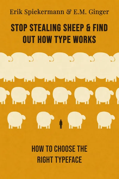
Stop Stealing Sheep & Find Out How Type Works
How to choose the right typeface
Description
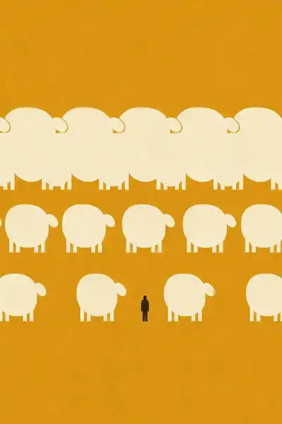
There is an old typographers' trick behind the strange title of Erik Spiekermann and E.M. Ginger's book, first published in 1993 and reworked for a second edition in 2003. To teach apprentices about spacing, an early instructor supposedly warned that setting letters too close together was like leaving too little room between the sheep in a fold — and setting them too far apart was like stealing sheep, because the gaps gave the thief room to slip through. The lesson stuck as a mnemonic for something most of us never think about: the space between letters, the shape of a comma, the weight of a stroke. Spiekermann, a German designer who helped shape the corporate look of companies from Volkswagen to Berlin's public transit, wrote the book to drag all of that out of the trade and into daylight.
His premise is disarmingly simple. Type is everywhere — on the cereal box, the road sign, the phone bill, the paperback, the screen — and almost none of us notice it, which is precisely how it does its work. A good typeface behaves like a good waiter: present when needed, invisible otherwise. But invisible is not the same as neutral. Every letterform carries a voice, a period, a set of manners, and those choices quietly steer whether we keep reading, trust what we read, or drift away.
The book is not a manual of rules so much as an invitation to look. Spiekermann and Ginger want the reader to develop an eye — to feel the difference between two fonts the way one hears the difference between two accents. Once that sensitivity switches on, it rarely switches off, and the printed world starts speaking in a language it was using all along.
The question we’re asking : How do we choose the right typeface, and why does that choice quietly matter more than we assume?What we’ll see : An education of the eye — learning to see type, tell one letterform from another, match it to its purpose, and understand what happens when we read.
Table of contents
01Chapter 1 — The letters we stopped seeing
Spiekermann opens by pointing at a truth so ordinary it feels like a joke: we are surrounded by type from the moment we wake, and we look straight through it. The morning is a small avalanche of typefaces — the alarm clock's numerals, the toothpaste tube, the newspaper's headline face and the smaller one holding its columns together, the logo on the coffee bag. We read all of it and register none of it as design. That transparency, the book argues, is not an accident. It is the goal. Type that calls attention to itself has usually failed at its actual job, which is to carry words from one mind to another without friction.
But invisibility hides how much is going on. Spiekermann likes to compare typefaces to clothes and to voices. We would not wear a tuxedo to fix a car or a boiler suit to a wedding, and we adjust how we speak depending on whether we are ordering coffee or delivering a eulogy. Type does the same work of register. A wedding invitation set in a blocky sans-serif reads as a mistake before a single word is understood; a tax form set in a florid script would feel faintly absurd. The letters are saying something before the sentences do.

02Chapter 2 — Why one typeface is never like another
Once the eye is awake, the next task is telling typefaces apart — and here the book gets practical about the differences that actually matter. The biggest division is between serif faces, which carry small finishing strokes at the ends of letters, and sans-serifs, which do not. Serifs like Times or Garamond carry centuries of association with books, authority, and continuous reading; sans-serifs like Helvetica or Spiekermann's own Meta feel cleaner, more modern, more at home on signage and screens. Neither is better. Each is a tool with a grain.
Spiekermann is careful to dismantle the myth that a typeface is just a shape you pour text into. Every face is a solution to a specific problem, designed by someone with a purpose. Some were cut for newspapers, where narrow columns and cheap paper demanded letters that stayed legible when squeezed and printed roughly. Others were drawn for luxury, with delicate strokes that need generous space and fine printing to survive. Using a newspaper face for a perfume ad, or a display face meant for posters as the body text of a report, is like miscasting an actor — technically possible, quietly wrong.
03Chapter 3 — Fitting the type to the job
With the vocabulary in place, the book turns to the decision itself: how to actually choose. Spiekermann's approach is less a checklist than a set of questions. Who is reading this, and under what conditions? A pensioner squinting at a medicine label, a commuter glimpsing a sign at speed, and a reader settled into an armchair with a book have wildly different needs. A face perfect for one can be cruel to another. The first move is always to picture the reader before picking the font.
Then there is the matter of quantity and space. A phone directory, cramming thousands of entries onto thin paper, needs a face engineered for density and legibility at tiny sizes — which is exactly why Spiekermann spent years designing faces for precisely that punishing use. A single word on a shop front can afford to be expressive and strange. The more text there is, and the longer someone must stay with it, the more the typeface must recede and simply serve. Display and text are different jobs, and a face good at one is often bad at the other.
04Chapter 4 — Reading is a physical act
Step back from the individual choices and Spiekermann's larger claim comes into focus: type is not decoration laid on top of language, it is part of how language reaches us at all. Reading, in the book's telling, is not a purely mental event. It is physical. The eye does not glide across a line in a smooth sweep; it jumps in short bursts, pausing to take in clusters of letters, then leaping ahead, occasionally darting back to check. Typography either cooperates with that mechanism or fights it, and the reader feels the difference as ease or effort long before they can name the cause.
This is why the book treats type as a form of behavior rather than taste. The shapes we choose shape what happens in another person's body — how quickly their eye tires, whether they finish the paragraph, whether they trust the page enough to keep going. A well-set text is a courtesy extended to a stranger. A badly set one is a small, unnoticed rudeness that most people register only as a vague reluctance to read on. Spiekermann's insistence that spacing and legibility are ethical as much as aesthetic runs through the whole argument.
05Conclusion
The book comes back, in the end, to that fold of sheep. The old spacing lesson turns out to be a whole philosophy in miniature: type works when the elements are given their right distance from one another — close enough to hold together, open enough to breathe. Spiekermann and Ginger spend two hundred pages proving that this modest craft governs an astonishing share of daily experience, and that its mastery lies less in rules than in a trained willingness to look.
Related books