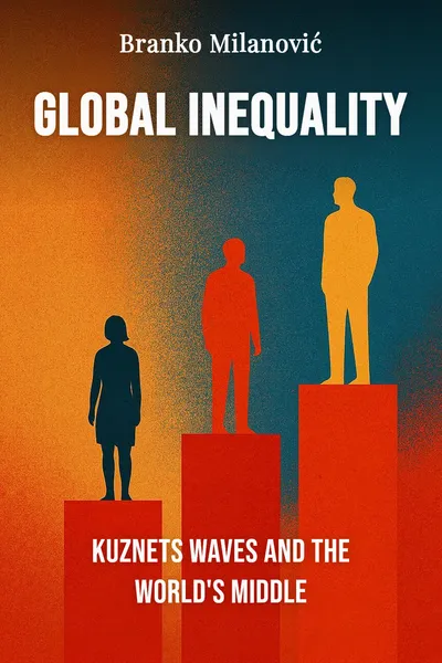
Global Inequality
Kuznets waves and the world's middle
Description
Around 2012, an economist at the World Bank plotted a chart that looked, when you squinted, like an elephant. On the horizontal axis: everyone in the world, lined up from the poorest to the richest, in a single global distribution. On the vertical axis: how much each slice had gained between 1988 and 2008, roughly the two decades after the Cold War ended. The line rose sharply in the middle, dipped near the top, then shot up at the very end. Branko Milanovic, who drew it, spent years afterward explaining that the animal shape was not the point. The point was who the trunk and the back belonged to.
The great swelling in the middle was hundreds of millions of people in Asia — Chinese and Indian households moving out of poverty at a speed no economy had managed before. The sag just short of the top was the working and lower-middle classes of the rich world, whose real incomes had barely moved in twenty years. And the tip, the raised trunk, was the global one percent, pulling away from everyone. One chart, three stories, all true at once. It became one of the most reproduced images in economics, cited in campaign speeches and think-tank reports that often drew opposite conclusions from it.
Milanovic had spent a career measuring something most economists had left to one side: not inequality inside a country, but inequality across the whole planet, treating a farmer in Malawi and a banker in London as members of the same distribution. That vantage point changes what the numbers say. It also revives an old idea — that inequality moves in long cycles — and pushes it somewhere its author never took it.
The question we’re asking : When we line up everyone on earth in a single income distribution, who has been gaining, who has stalled, and where does the pressure land?What we’ll see : How a global vantage point rewrites the story of who won the last thirty years — and why the fault line runs through the border.
Table of contents
01Chapter 1 — The elephant that redrew the map
Most inequality talk stops at the national edge. We ask whether a country is more unequal than it was, whether the American gap is worse than the French one. Milanovic's move was to ignore the borders for a moment and ask a blunter question: taking all seven billion people at once, how is income shared across the species? The answer requires stitching together household surveys from more than a hundred countries and converting incomes so that a dollar buys the same real basket everywhere. It is laborious, imperfect data work, and it produces a picture no single-country study can.
That picture is the elephant curve. Read left to right, it shows the global middle — overwhelmingly Asian — gaining fifty to eighty percent in real terms over two decades. It shows a distinct group around the eightieth to ninetieth percentile of the world, the lower-middle classes of rich democracies, gaining almost nothing. And it shows the global top gaining enormously. The same period that lifted a Vietnamese factory worker also left a German or American worker roughly where their parents had been. Both facts sit on one line.

02Chapter 2 — Kuznets, revised into a wave
To explain the shape, Milanovic reaches back to Simon Kuznets, the economist who in the 1950s proposed that inequality inside a country follows an arc. As a society industrializes and people move from farms to cities, the gap first widens, then, as education spreads and the state redistributes, narrows again. Plotted, it makes an upside-down U. For decades this Kuznets curve was near-canonical: get rich, and inequality would eventually take care of itself. The trouble was that after about 1980, inequality in the United States, Britain and much of the rich world started climbing again, straight past the top of the arc it was supposed to have descended.
Milanovic's proposal is that Kuznets was not wrong, just incomplete. Inequality does not follow a single hump and then flatten forever. It moves in Kuznets waves — repeated cycles of rising and falling, each driven by a wave of technological and structural change. The nineteenth-century industrial revolution drove one wave up; the mid-twentieth century, with mass education, strong unions, high taxes and the leveling shock of two world wars, drove it down. The information-technology revolution and globalization since the 1980s have driven a new wave up again. What looked like a broken curve is the start of a second cycle.
03Chapter 3 — Who won, who stalled
Underneath the global curve are two engines pulling in different directions, and separating them is what makes Milanovic's account useful. The first is inequality between countries — the gap between the average American and the average Ethiopian. For most of the last two centuries that gap widened relentlessly, as the West industrialized and the rest did not. The second is inequality within countries — the gap between rich and poor citizens of the same place. Global inequality is the sum of these two, and for the first time in a long time they have moved in opposite directions.
Between-country inequality has been shrinking, and the reason has a name: Asia. China and India together hold well over a third of humanity, and their rapid growth has narrowed the distance between the world's poor and the world's rich more than any policy ever did. This is the great convergence, and it is doing most of the work in reducing global inequality overall. But it is uneven. Much of sub-Saharan Africa has not converged; some of it has fallen further behind, so that the very bottom of the global distribution is increasingly African while the middle fills with Asians.
04Chapter 4 — The pressure builds at the border
This is where the whole architecture comes to a head. If most of your income is determined by your country of birth, and if that fact is now measurable and, increasingly, visible on a phone in every village, then the rational response is obvious: move. Migration, in Milanovic's account, is not a side issue in the study of global inequality. It is the pressure valve of the entire system — the single act that lets an individual close, in one journey, a gap that centuries of national development could not close for their homeland.
The bind is that migration collides with the other force holding the numbers up. The citizenship premium exists because rich countries are, in effect, clubs — bundles of institutions, infrastructure and accumulated capital that make labor there worth many times what the same labor earns elsewhere. Open the club fully and you would sharply reduce global inequality, because people would flow toward the premium. But the citizens who already hold the membership tend to resist, and the stalled global middle in the rich world — the sag in the elephant's back — is the group most anxious about newcomers competing for what feels like a shrinking share. The politics of the border are the politics of that curve.
05Conclusion
The elephant curve endures because it refuses to let anyone tell only half the story. Line up the planet and you see the two truths that national statistics keep apart: an Asian middle that vaulted upward, a Western middle that stood still, and a global top that ran away from both. Milanovic's revival of Kuznets — as a wave rather than a single arc — turns inequality from a phase a country grows out of into a cycle with drivers, one that rises and falls according to technology, institutions, and sometimes shocks nobody would wish for.
Related books